Saturday, September 29, 2012

Film Magazines


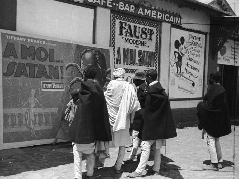
The purpose of a film review is to analyse and evaluate upcoming or new films so that audiences can make a balanced judgement as to whether or not they want to see the film. A film review will get across the genre, narrative and structure of a film, giving the audience enough knowledge and understanding of the film, but not giving away the whole plot. An audience values editorial opinions over adverts. A film review article can be seen as non biased as it comes from a 3rd party opinion, and not from someone specifically trying to promote the film, but from a journalist. This can be risky for the film marketing campaign as they could receive bad reviews and low ratings which would put people off wanting to see the film. On the other hand, they could get an outstanding review and use it as credibility to put on film posters. However, some film magazines, such a pre-vue are written for a specific cinema, and the only role of the article is to convince you to watch the film and avoids a balanced judgement. 

Different types of film magazines target different audiences, and therefore will have different purposes when writing their articles. A magazine will be written for the magazine audience, not for the audience the film is aimed at, which makes it vital for audiences to find the magazine that suits them. This also opens a large market for film review magazines, as as long as you can find an audience who will want to read what you're writing, you could review all the same films as another magazine, but in a totally different light. A Film review is different from a poster as it relies more on written codes and context, rather than symbolic codes and pictures, however, they are important too. Film reviews have different conventions to a film poster, the conventions are as follows:
  • Section titles
  • Headline
  • Strap line
  • Introduction
  • Subheadings - these break up large pieces of text, making it easier to read.
  • Breakout paragraphs
  • Breakout boxes
  • Columns - the amount of columns on a page will vary according to magazine, depending on the audience the magazine is aimed at. Small columns filled up with mainly text will suit magazines who take film very seriously, or academic film reviews. Magazines with larger columns, filled with words and pictures will be for those interested in films and wants to read about them, but only because they need to decide if the film is worth seeing.
  • Pictures
  • Graphics/Logos
  • Font and typography - Titles are usually done in sans-serif, whilst bulk text is done in serif.
  • Call to action
  • Byline - informs you as to who has written this article. The more well known the journalist it, the bigger byline they will receive. 
  • Issue information
The main film magazines in the UK are Total Film, Empire and Sight and Sound. All 3 magazines are trying to reach out to different target audiences and although they follow the basic conventions of a film magazine,  they do this through their style, layout, content and mode of address.

This is an example of a film review in a magazine called Total Film:


Total Film is a magazine that is published every 4 weeks and is the 2nd biggest selling UK film magazine. It had 5 main sections; dialogue, buzz, agenda, screen and lounge. All quite relaxed titles that discuss different types of films. It uses casual, basic language that everyone can understand, but at the same time makes it enjoyable to read. For example, the strap line reads in the above article, "No country for a middle-ages man (and his boy)." This is a play on words of the book/film "No Country for Old Men" which was written by Cormac McCarthy, the same novelist who wrote the original book, "The Road". This type of strap line is trying to attract the readers attention, but it is also assuming the audience will be able to work out the link between the two films, and again assuming the audience know at least a little about films. It is designed to suit a younger audience who watches films as a means of enjoyment but also has a keen interest in film, but not as far to say the magazine is designed for academic purposes, this is connoted by their mode of address. 

Total film uses a range of colours in the their articles to show different sections and to draw your attention to the different breakout boxes. The use of graphics makes the whole page look aesthetically pleasing. The graphic at the bottom left hand side of the above article is a diagram which clearly shows how interesting the film is. The way it is laid out is reader friendly, and all the text is spaced out and separated into sections, rather than having everything incorporated into one main text. 
  In this particular article, there is one which picture takes up the top half of the page. The image and text are equally balanced which connotes that neither one is more important than the other, and also suggests that this is not an academic film journal, such as the likes of Sight and Sound. The caption below the main image reads, "After another muddy year, they vowed it would be their last Glastonbury." This is supposed to humorous, and actually has nothing to do with film, it is purely for entrainment purposes, which again connotes the type of audience Total Film is trying to attract.

The typical Total Film article will give you a brief description of the film, making sure not to spoil the plot or tell you what happens at the end. It also gives a balanced judgement as to whether it is honestly a good film or not. Total film will also make references to other films, for example the "see this if you liked... " break out box. The article will then end with an overall summary and be the deciding factor on whether they think a film is work seeing or not.

This is an example of a film review in Sight and Sound:


Sight and Sound is the official film journal of the BFI (British Film Institute). It was first published in 1932 and has ever since played a big role in the film industry.  Sight and Sound is a boarder line academic journal. The mode of address is very pretentious and analytical, suited best for those who don't just watch films for enjoyment, but study them as an intellectual hobby. An example this mode of address comes from the above article, "It is also typical of French auteur cinema that the lead female characters are middle-class and artistic while the working-class woman is a garish prostitute." The article is very opinionated and uses language that not everyone may understand, for example, "verisimilitude". However, the article does try to incorporate a little, so called humour, into their article in their image caption. It reads, " Aids Memoir", which is a play on words. The caption then goes on to list the actors in the photograph and then describes exactly what they are doing, with no messing about. 

Sight and Sounds stick to a very sensible blue header and blue text for the caption, but apart form that, all other text is in black, again denoting the prestige of the magazine and what type of audience it is trying to attract. There are 3 images within this article, however, the writing is still prioritised and takes up more space the images. There are no graphics used to identify the section title, which makes the page look more sophisticated. 

The typical Sight and Sound article will include 7 main sections. The first will be references to other films and name dropping, we see this in the 1st paragraph of the above article, "Homosexuality takes centre stage rather than being relegated to a subplot as in J'embrasse pas (1991) Les Roseaux sauvages (1998)" This assumes that the audience is very familiar with other french art house films, and can also read french. The second section will be a very detailed synopsis of the film, covering the whole narrative, even the ending. This will then be followed by an analysis of the narrative, including a balanced judgement. The fifth section refers to the academic themes of the film, followed by context information, then ending with a summary of the film. 

The types of films that get the most coverage in Sight and Sound are independent art house films. The writers of Sight and Sound assume the audience knows a lot about films, directors and certain vocabulary. 


This is an example of a film review in Prevue:


The film magazine "Prevue" can be picked up for free in the foyer at vue cinemas and is known as a In-House magazine. The sole purpose of the magazine is to sell all films currently being shown at the cinema in order to gain customers. As you can see when reading the above poster, there is no analytical criticisms of the film, there is nothing bad to be pointed out about it, which I am sure is not truly the case. The mode of address in this film review is chatty and informal. A prime example of this is the over use of punctuation on the line, "What do you think!?"

Empire magazine is cross between Total Film and Sight & Sound, it caters for those who enjoy films and an intellectual level, but does not into detail as far as Sight & Sound.


Film magazines, such as Total Film and Empire are also available to subscribe online. These versions of the magazine are made to be more accessible for commuters and workers on the go. It gives viewers the flexibility to read the magazine at just a click of a button, as it is sent directly to their emails, the day it is released.

Friday, September 28, 2012

Magazine Film Review Purposes

Magazine film reviews are curtail to the film industry when it comes to trying to attract audiences to come and choose to view the film, especially for short film as audiences must go out of their way to view them usually through various internet sites or film festivals etc. Therefore, production companies rely hugely on film reviews in special film magazines such as "Total Film" magazine or " Sight and Sound" magazine. Film reviews are relied on majorly by production companies, if not more than film posters themselves for various reasons.

Film reviews in magazines are used for many purposes one of those being to target film audiences. Audiences use film reviews to find out more detailed (if written correctly and depending on the film magazine) information about the film they wish to see as it focuses more on narrative and the synopsis. However, different audiences choose film magazines which suit their needs and desires therefore a review's style is varied between the magazines such as "Sight and Sound" magazine gives an extremely detailed synopsis; where as not all audiences wish to know every single detail about a film but want a more condensed synopsis so that it was worth for them to go and view the film.

Also, magazine film reviews are used by audiences to view a 3rd person opinion or recommendation: due to the fact that the reporter or journalist who reviews the films is not usually linked into the specific film's production company means that the review should be unbiased and will give a professional and academic opinion. However, this can depend on the type of film magazine as seen with the "PreVue" magazine the review had no critical information what-so-ever meaning it was overly positive for a review on a film, yet this can be possible if there is a phenomenal nation wide recognised success.

Audiences understand that film posters are biased due to the fact that they are created by the production company of the specific film meaning it would obviously be completely positive in order to market the film in a way to make it look attractive to the audiences e.g. even if a film company understand the film is not fantastic they would still put forward the biased idea that it should be a success such as for the movie "Cat Woman". Therefore, audiences may look at film posters for basic information on the film: the title, tag line, the actors etc but will use magazine film reviews to make a final decision normally as they want editorial opinions and see what the professionals thought of the film. It helps them see a well rounded opinion on the film both with honest positive points as well as criticisms though what must be kept in mind is that not all film magazines do this: there are magazines who either do not want to add criticisms as they want to promote the film itself, or due to the fact that most film magazines rely on advertising from production companies for their profit therefore if they continuously write negative reviews about a certain production company they may pull out or try "buy" good reviews in exchange for either profit or interviews with mainstream actors etc.

As audiences rely quite majorly on magazine film reviews to choose whether they want to view a particular film: be it mainstream or short film, film production companies see the reviews as important to the film's marketing campaign as if they only had a film poster audiences may get some kind of interest of the film but there isn't a certainty they will get audiences spending money or sharing their film. However, there is a risk factor in this: a film company does not guarantee a great review from a film magazine therefore there is always an element of risk that a certain film will get a bad review, putting off audiences rather than bringing them in. This is because most (must remember not all) film magazines have honest opinions on films therefore there will be criticisms where found to show a balanced review.

Thursday, September 27, 2012

Film Poster analysis: Dawn of the Dead


In order to understand film posters further, I have decided to analyse the technical, written and semiotic codes  of this poster for the film Dawn of the Dead. In the image above I have highlighted the main features of the poster, and as such if any are mentioned please refer above.

The poster makes use of minimal design so as not to distract the viewer from the main aspect of the poster. We see the symbolism of the poster - the top half of a head - take the main focus of the poster alongside the title of the film. The title of the film is angled to create a perspective effect in order to draw the eye towards the head at the top of the title. These two elements take up the majority of the space in the poster, however do not take up as much space as possible to allow room for other elements.

We see the tagline of the film appear at the top of the image (an iconic quote from the film's marketing), which indicates to the viewer that the film is a horror film by making use of typical horror conventions. Quite unconventionally, the poster has no main casting credits; the poster has instead credited the director, George A. Romero. This is important - because the actors of the film were virtually unknown, the poster instead relies on the success of the director to appeal to the audience. In addition, Romero had a large fanbase and so by including his name as the focus the poster could draw in existing fans of his work (shown with the use of the director's previous works).

The symbolism of the head also helps the audience deduce the film to be horror, due to the use of red as a shadow effect to denote blood. In addition, the poster extensively uses red to further this implication of a horror film. Finally, the poster includes a mandatory billing block, along with a certificate warning that takes up a small chunk of the billing block. Inside the billing block, the words "Red the St. Martins Book" are included. Since there are fewer words than a modern film in the block, a viewer is more likely to spot this. This can help draw a potential audience in by introducing them to the book first, so that they know what to expect when watching the film. The rest of the block credits various people, including the main cast, producer and director.

Film Poster Analysis: Tinker Tailor Soldier Spy


The poster for Tinker Tailor Soldier Spy utilises several technical, written and semiotic codes to convey the content of the film to the viewer. In the above image I have highlighted and colour coded the main aspects of the poster and uses of codes.

The poster makes heavy use of blue, to denote the film as being dark in nature as well as giving the impression that the film is serious in tone. The main focus of the poster is on the centre figure, Gary Oldman, who plays the main character - Oldman is also given the priority in the acting credits. This is done not only to educate the viewer on the main aspects and type of film it is, but also to sell it more effectively by using Gary Oldman's reputation as a well-known and well-respected actor. The rest of the cast is displayed in the background, appearing in a similar fashion to a grid, which combined with the faint text of the background gives the impression of a CCTV unit, playing into the themes of the film. Along with the actor credits along the bottom of the title, the director is also given a main credit - the director, while not well-known, had previously made a highly successful Swedish language film that found success in the UK and so could use his name to bring in a greater audience through association with that successful film.

Unusually, the poster doesn't make use of a tagline (the film's tagline was "the secret is out" but would only feature at the very bottom of certain posters and was not very visible), instead relying on the cast and reviews to sell the film to the audience. The reviews take up a large amount of space on the poster so as to draw the eye in, and are placed at the top to make them more likely to be read first. This way, the poster can give off a good first impression to the viewer before they've judged the film based on looks or on the actors.

Wednesday, September 26, 2012

Film Posters and written codes

Written codes in film posters mostly have to do with the title and the tag lines. Tag lines are short phrases which tend to be catchy and give away clues to what the film could be about in an interesting and memorable way. Usually tag lines are just one sentence long and the majority of the time, they use puns, play on words, alliteration, and the rule of 3 etc. The tag line reinforces the genre to the audience as well as the narrative of the film therefore this one short sentence is vital on a film poster meaning that my group and I will have to plan out and come up with an enticing tag line that is memorable, unique and actually shows a summary of the film with as few words as possible. Also, the title itself uses written codes, be it how the title is written or the actual text of it.

Film Posters and symbolic codes (semiotics)


Semiotics have to do with symbolic codes and is the study of signs and symbols and the messages we read from them. Film posters are more planned out than most people may initially predict as semiotics are used in every single one of them to add more meaning and symbolism to them. Semiotics are used as audiences process much of their information purely from visual imagery contained in film posters therefore when my group and I create our own film poster, it will have to be well thought out and semiotics will have to be used to deepen the poster. Therefore, my group and I will have to put visual codes and semiotics into thought in order to make a film poster which has more depth to it and can be seen that all that is in them has a purpose which is extremely important: we must not choose a colour or an image purely because they "look nice" but we must have a purpose for them and show audiences more meaning in the film posters for example if our short film is to do with horror the colours we would choose would be dark and gritty as they have interpretations of fear and terror, or if we have a romance short film the colours chosen would be more delicate such as red as that is a stereotypical romance colour, and images would be of things such as romance stills from the film or roses, kisses etc.

Film Poster Conventions (technical codes)


Just like anything else, film posters follow a set of conventions in order to be the most effective and successfully put across the needed information as well as entertainment for the audience. In this section technical codes will be explored and explained. Technical codes have to do with the techniques used in the construction of a text. The usual techinical codes used in film posters are as follows:
-a picture of the star or iconic image from the film
-film title
-tagline
-BBFC certificate
-Billing block
-background image
-name or names of main stars
More or less can be included depending on the film for example short film posters do not always have a picture of the star, or the name of main stars which is something my group and I will have to consider when it comes to making our own film poster for our short film. These technical codes are specifically chosen for purposes. A picture of the star or iconic image from the film is used so that audience can visually get a first impression of the film without having read information on it or seen the film itself; it helps audiences see either who is acting in the film or possibly the plot/genre of the film.

The film title is quite simply used so that the readers know the title of the film. This way they can get an idea of what the film is about (if the title has been chosen to reflect the film) but also can remember it, research it, find trailers etc. If the film title was not on the poster then it would cause a lot of confusion and could decrease the amount of people able to access or watch the film. Next, the tag line is usually used on a film poster to in a way summarise the film in a short sentence. Again it usually is something fairly memorable and allows the reader to know more about the film without having to have read the synopsis.

Moving on, the BBFC certificate is important as it allows audiences to understand the contents of the film and who it is suitable for e.g. if an adult is looking for an adult film to watch, if there is no BBFC certificate on the film poster they may end up watching a U film instead of one more suitable for them, same applies for younger audiences. The billing block is a technical code which is more important institutionally rather than for the audience; this is because it has details about producers, directors, other members of the cast or behind the scenes team etc which is not always what the audience is interested in however it helps the film poster to be recognised as a film poster. The final technical codes are fairly self explanatory. These are all the conventions that will need to be considered by my group and I when creating a film poster for our short film.


Film Posters Over Time

Film Posters were around since the beginning of films, even before that when theatre was the main means of entertainment using posters to show society what was going to be shown, when and where, much like film posters today. Similarly to films theme selves, film posters have developed and adapted from decades ago to now through the change in technology, styles, trends etc.

To begin with, a good example to look at for an older film poster is the one for "Brief Encounter", which shows the difference clearly between film posters now and then. Due to there not being computers or printers 90 years or so, the film poster is seen to be painted, which is what normally happened in those times making them much more expensive and time consuming to produce therefore film posters were rare. The characters are seen to be in black and white just like in the film itself however the bright yellow background was clearly chosen to attract audiences to see the poster and choose to view it. A major difference in film posters back then and now is the amount of text used: posters these days tend to have a few short words on film posters to keep it simple and concise and make it easier to remember, this poster has several different pieces of text to explain the title, the actors, the places to view the film etc.


Moving on to a further time, the "Wizard of Oz" poster has similarities and differences to the "Brief Encounter" film poster. One of the similarities is that the poster, like the previous one shown, is also painted rather than a photograph or digital graphics made on the computer. It was a choice to do it with paint however, as the poster to the right shows not only painted characters but also two photos of scenes in the film meaning the characters could have also been shown as photographs but the producer of the poster decided to use paint for a vintage effect. The use of 3D is showing to start to form around this time with the title of the film painted with a 3D effect to show that film posters were beginning to be more modernized and different, making them pop out more and catch the attention of audiences more successfully. A noticeable attribute to older film posters compared to more modern film posters is that they do not tend to have tag lines most of the time, just a picture of some sort of the film along with the directors, producers and most importantly actors.

Moving on to the 90's, movie posters had clearly developed more but all had a similar type of layout just like the one shown on the left for the movie "She's all that": the main characters posing (usually not showing a specific scene from the movie), very simple however bright, memorable therefore effective. This film poster has the two main characters, a tag line at the top (showing that tag lines were now introduced), a title of the movie, the names of the main actors and the billing block. This layout is now what is seen as conventional and most film posters, even today, follow it. The reason for the actors posing in this film poster rather than a screen shot of a scene in the film is purely due to the fact the more mainstream actors were being cast in films therefore audiences would want to see whether their favorite actor was in the film. Again, as mentioned before, my group and I will probably not follow this as no mainstream actors are realistically going to be cast in our short film.

Finally, an example of one of the most recent film posters is shown on the left for the new film "Sinister". The poster is much more graphically pleasing to the eye with well thought out effects making it simple yet effective. The layout shows it is well spaced out and clearly shows audiences it is of the horror genre with the blood and the mysterious little girl especially with the tag line seen "once you see him, nothing can save you". Like all film posters it has the title, actors and like the more modern film posters a billing block. This means when my group and I make our film poster for our short film, a billing block and title are vital though obvious but also we must decide whether we want to keep an older layout where actors are posing or a more modern layout where there is a screen shot from the film. The typography is also quite important as for this film the font for the title links in with the horror genre which is something my group and I must also consider.

Film Poster

 
Film Posters are examples of fairly ordinary posters however they are used to advertise upcoming films be it main stream or short film. They have both institutional and audience based purposes which is why they exist in the first place. Firstly, there are fewer institutional based purposes than audience based such as the basic purpose of advertising a film. This means a film can be advertised along side a trailer or without it for people on the move, magazines or locally. Also, similar to advertising a film, film posters promote a film to it's target audience which is important so that the correct audience choose to go and see the film or access it rather than mislead the wrong audience.

When it comes to the audience, there is one main purpose that links in with so to speak "sub-purposes" for film posters, this being to find out about films. One of the main things film posters allow audiences to find out about a film is the actors: this is important as especially for mainstream films where they cast well known famous actors, the actor's specific fans can be targeted this way as they would be dedicated and want to see the newest film their favorite actor is in. However, this is more difficult for short films therefore usually the actors are not mentioned on the poster as most of the time they do not cast well known actors to the main stream world. My group and I might choose to not put the actors on the film poster for this same reason in order to save space but also because no Hollywood mainstream actors will be cast.

Film posters are used by audiences for distribution information such as release date which is extremely important as if audiences do not know this information they will not know which cinema to go to or when in order to view the desired film. This is more true for short films as they usually only show in a small amount of venues therefore film posters are vital for audiences to know the specific locations they need to go to. Moving on, though obvious, a film poster is used by audiences to find out the title and to see the tag line which though basic and quite vital purely because a film poster uses minimal writing but mostly images therefore the small amount of writing that there is is specific and must give enough detail about the film and the plot of it without a large amount of text. The narrative links in with this.

Film Posters do not have a limitation of where they are located. However, the most popular place for them to be located is on the side of roads or through the use of public transport. When they are by the side of roads, it allows drivers by to view them, and due to roads being used by a wide variety of people, there is a guarantee at least a small amount of the target audience will see the posters. Public transportation is also used quite successfully to distribute film poster e.g. at tube stations where people can view them as they are passing a station or waiting for a tube, or on buses so that pedestrians can view the posters as buses drive by, or bus stops where audiences can view the posters as they are waiting for their bus etc.


Harry Potter and the Order of the Pheonix


Harry Potter and the Order of the Pheonix is the 5th installment to the extremely famous Harry Potter series. The themes for this films is magic and adventure, both denoted by the wand in the central characters hand and the tagline. The moody feeling given off by the poster reflects what has happened in the previous films, and gives us a hint of what is yet to come.

Written codes are incorporated into this film poster through the words and context. The tagline reads, "The Rebellion Begins" and is a very clear indication that the film is going to be jam packed with excitement and adventure. The tagline motivates you to want to find out more and see how the rebellion is going to end. 

Symbolic codes are utilised in this film poster and features images off all the supporting actors, starting with the most essential characters to the plot nearest to the front, as well as the main star, Daniel Radcliffe. All characters in the image are looking very serious and tense, denoted by their hostile expressions and folding of the arms. The connotations of this is that the film is going to be dark and thrilling. You know he is the main character as he has been singled out and placed center stage, facing the camera full on. There is a dark, eery background to the main image, mirroring the themes of the film, maybe implying this film is going to be dark and scary. However, around the main characters head, there is a halo of light, again denoting he has the main role. This film uses a well known font, unique to the Harry Potter films for its title. Straight away you are drawn to the one-of-a-kind, magical graphics which compliment the theme of the film. The tagline is positioned at the top of the poster, the font is serif and the white stands out against the black background, also creating a dark and mysterious feeling to the film. 

The poster used technical codes to give out important information to the audience. The film title is the most important aspect of this poster. As the films are extremely famous and well known already, just by seeing the name "Harry Potter", the audience will know what the themes and genre of the film are, and probably due to already reading the books, knows what is going to happen. By having the title so big, the audience will be able to make the link between the books and films and want to see the film. There is a billing block at the bottom of the poster, giving out extra information, and generally just making the poster look like a film poster. The billing block will include a short list of the people involved in making the film and/or poster. The date of the release of the film stands out in the billing block, it is very important for advertisement purposes that the audience can know when they will be able to see the film. The tagline is incorporated into the poster as a type of slogan, to reinforce the film into the audiences mind.

Angus Thongs and Perfect Snogging Poster


Angus, Thongs and perfect snogging is a typical teenage chick flick, filled with cringe-worthy moments and chasing the boy of your dreams.  The theme of this film is straight away very obvious to the audience, due not only to the name, but to the images. The main image is of a young, teenage girl, denoting the film is going to be based around teens, the graphic of the symbolic pink kiss mark by the title also gives off the idea that the film is going to be about teen romances.

The poster makes good use of written codes and the tagline on this poster is, "Georgia Nicholson is not going mental, but her life is." The tag line gives indication that the film is going to be about the hectic life of a teenage girl, but at the same time doesn't give away any of the story line. It motivates you to want to know more and actually see the film.

Symbolic codes are also used in this film poster and they help identify the target audience for this film, which is obviously female teenagers. We can denote this due to the colourful images used which take up the top half of the film poster, the images here are a mixture of still from the film and cartoons. The cartoons suggest the genre of the film as being cheerful and animated, and the audience gets a greater understanding of what age range the film has been created for. This poster clearly highlights who the main character is, by having her picture larger than all the others and drawing focus into her. The minor characters are shown above her as smaller images, and therefore signifies that they are not going to be the main focus of the film. The facial expression on Georgia, the main character, denotes that this film is going to be light-hearted and comical. Having the background images placed around the main characters head denotes these are her thoughts, and all these different characters and situations are what is making her life "mental" as the tagline says. The tagline is split in half by different coloured text, not only bringing attention to it, but also adding more meaning to "but her life is." The font type used throughout this poster is very simple and sans-serif, indicating this is a laid back, girlie film. Not only does the font indicate the target audience, but it also is very eye catching. It's big, bold and emphasises the word "snogging", which indicates factors of the plot.

Technical codes play a large role on a film poster, and give out the standard information the audience needs to know. The film title is there to let the audience know the name of the film. In this case, the title also reflects what the plot may be about. Now the audience know the name of the film, they may look out for other trailers or posters so that can get to know more and decide whether they want to see the film. The tagline is incorporated into the poster as a type of slogan, to reinforce the film into the audiences mind. There is a billing block at the bottom of the poster, giving out extra information, and generally just making the poster look like a film poster. The billing block will include a short list of the people involved in making the film and/or poster. The poster also includes a BBFC certificate which is vital as it enlightens the audience into what is the youngest age that a person can be to watch this film. This film is rated a PG, which doesn't mean the target audience is under 12's, on the contrary it is aimed at over 12's, it just allows the audience to see that there is nothing unsuitable in this film that may upset younger audiences if they were too watch it.

Teenagers may feel they are going to be able to relate to this films themes just by the technical, written and symbolic codes represented on the film poster. The film certificate indicates that the feature is going to be suitable for many ages, from young teens upwards.

Film Posters


A film poster is created in order to advertise and promote a film. Film posters can come in all different shapes and sizes, to fit on the sides of buses, on billboards, at train station, on phone boxes, pretty much anywhere you would find a member of the public passing by.


Today's posters usually obtain a number of conventions:

  • Photograph of main star
  • Title
  • Tagline
  • Certificate
  • Billing Block
  • Release Date
  • Background images to give more detail
  • Graphics
These conventions all come under 3 specific codes:
  1. Technical codes
  2. Written codes
  3. Symbolic codes
These are all included so the audience can pick all the information about the film that they need in a quick glance. In that case, it is important for the poster to capture the interest of their target audience, if it fails to do that, then there is not much chance of people wanting to watch the movie. 

Film posters have been used since the very early days of film. They began as just simple placards as a sort of TV guide outside a movie theatre, but now they have developed into a much bigger idea. By the early 1900's, film posters began to have artistic illustrations on them to suit their theme and to promote their films, this gradually progressed into having stills from the actual film as the main image for their film posters.


Originally, film posters were only made for the use of movie theatres, and had to be returned to the distributor after the time period of the show being shown was ended. In the 1940's, films could be shown around the country for several years, so film posters would be reused and recycled until they were too tattered to be used again. However, some posters were not reused or recycled and became collectibles. People collect film memorabilia in forms of posters, scrapbook, autographs and film magazines. The classic "one sheet" film poster would be the collectors ideal poster to own for each film. Today, film posters that were once practically free to get you hands on are being sold at very high prices, The record price for a posters was set on November 15th, 2005 when US$690,000 was paid for a poster of Fritz Lang's 1927 film Metropolis from the Reel Poster Gallery in London (source: wikipedia). Unlike in the 1940's when film posters were only distributed to theaters and poster venues by the movie venues, you can now purchase film posters online or in shops like HMV for not a high price. Modern film posters are not very rare or valuable.

As the film industry exploded, main different types of film posters were created for all different purposes and angles of promotion.
  • 27" x 41" - Referred to as "One sheet"
  • 41" x 81" - Referred to as "3 sheet"
  • 81" x 81" - Referred to as "6 Sheet"
  • 246"x108" - Referred to as "24 Sheet
  • Insert Cards
  • International Posters
  • Glass Slides
  • Banners
  • Standees
  • Door Panels
  • Lobby Cards - Like posters but smaller and can be collected. Their value depends on their age, quality and popularity. 
  • Teaser Posters - Also known as an advance poster is an early poster, created before the final details have been set. They usually just involved an image and no writing as to not reveal to much information, and making people want to know more. An example of this is the one above for Harry Potter and the Deathly Hallows Part 2, the final installment on the Harry Potter series. The poster contains no film title, just the  main image, the tagline and the date of release. A poster like this will work for such an iconic movie franchise, without even a film title, we know its advertising Harry Potter due to image of famous Daniel Radcliffe, Emma Watson and Rupert Grint who are well known for their parts in Harry Potter. The tagline incorporates the date of release, and notifies the audience in only a short words that this is the final film, this is were "it all ends".
  • Personality Posters - These posters are used where there may a few main characters so each character will have their own personal poster which promotes the film. A personality poster will contain an image of the character along with the name of the character and/or actor, as well as a tagline specific to their role in the film. 


Monday, September 24, 2012

Themes and Genre of Short Film


When it comes to Short Film, though there is a smaller time frame to work with, making certain themes and genres harder to tackle, initially there is no genre or theme that is off limits if they are approached the right way, with the right techniques and the right audience in mind. The brief for this coursework has asked the group to find some kind of way to explore issues and/or themes pertinent to British Identity therefore choosing a genre with themes that can incorporate "Britishness" is vital in order for the short film to be successful. In order for the short film to be a complete success my group and I must research existing films and try choose a genre that can tackle British Identity which will hopefully give room to incorporate British themes.

To begin with, researching genres was the first step as though there are many different genres which are available in the film world, the way to incorporate themes into a film is by choosing the right genre for example if the group were to tackle the theme of families in Britain it would not work in a horror genre but rather a drama or reality based genre. The short film "Virus" by Simon Hynd was analysed and seen to be a psychological thriller: this is an extremely hard genre and sub-genre to complete successfully as usually these types of films need enough time frame to build suspense and tension and have peak points. However Hynd did this beautifully and creatively meaning that if my group were to choose this particular thriller sub-genre my group and I would have to be extremely creative and use as many techniques as possible to create enough suspense and tension in a short time frame.

Another film researched was "Sign Language" by Oscar Sharp which is a British Mockumenatary. This means that it was specifically made with kinetic camera work and the conventions of a documentary but it is only mimicing a documentary. A genre like this would be ideal when it comes to feauturing Britishness as British Films are well known for their gritty, kinetic camera work type films which a mockumentary would help achieve.

Moving on, when looking at the short film "Gravity" by Colin Hutton it is seen to be a realist drama which is an exquisite British film that tackles typical British themes such as youths, gun crime, peer pressure etc. This short film had the typical British Film conventions: gritty, dark, real. It was extremely effective and clearly emphasized the Britishness therefore this genre would also be a good option for my group and I.

The one thing that struck me when researching short films was that there is only a small number of horror short films. It is easy to explain why this is as it would be hard to create the right suspense and peak moments in such a short period of time however if done correctly could be done. Therefore it would be an idea for my group and I to try a challenge and something different by having a horror genre and seeing whether we can achieve it.

Themes. All films, be it mainstream or short are focused on themes; it helps build the storyline, helps choose certain characters and scores etc. When watching the short film "Cherries" by Tom Harper the themes were seen to be deliquent youths, fights, bullying, war, and authoritarian government. These themes were tackled with a Britishness as a focus on youths and the education system in Britain are important issues that many British films try to tackle. Therfore it might be an idea for my group and I to try tackle the theme of youths in Britain and what comes with that.


What is a Short Film?

A short film is described as “an original motion picture that has a running time of 40 minutes or less, including all credits" by the Academy of Motion Picture Arts and Sciences (AMPAS). Short films were initially shown alongside that of a main feature, along with other content such as a newsreel. They were originally popular as cartoons and comedies. By the 1950's they had mostly left commercial cinema release due to the rise of television, leaving cartoon shorts until the 1980s.

Since it is difficult to gain a full feature-level narrative in under 40 minutes, stories are often brief or small in scale. A popular narrative technique is to use a “snapshot” story – a segment in someone's life in real time. Another method is to make use of montaging to show only key events to tell the narrative. Often a short film will leave its narrative open by the ending, so as to involve the audience more and solve the issue of a limited time to tell a full narrative.

A short film will often be more explorative with its themes than that of a feature-length– since there is less concern over target audience, a director will often create a short film for a more specific issue or theme. For example, the British Heart Foundation created a two-minute short film addressing heart attacks in order to raise health awareness. Short films are popular with animators, mainly because of the effort needed to animate a short film is considerably less than that for a feature film. As a result an animated short will often be part of a larger series if created by a studio. A good example is Looney Tunes, who produced a great number of animated shorts for theatrical release before moving to other media. In terms of genre, short films usually don't stray too far from traditional genres. When they do, they often do so for experimental purposes. Again, short film producers are generally less restricted by publishers and distributors to adhere to guidelines. In terms of production value (ie. Editing, titles, cinematography etc.) short films usually have a considerably smaller budget than a feature film, and as such these aspects are usually kept simple and practical, so as to avoid over-budgeting the short film. Titles are often kept simplistic and minimal.

A short film's purpose is often varied. Originally, they were used as a compliment to the main attraction, in order to create a “variety performance”-type showing. Nowadays, short films are usually made for several reasons. First, the director may be new in the business and so would want to create a short film in order to showcase his work and ability to major publishers. Directors such as Spike Jonze were able to break into the industry through short film. Another way that short films are used is for advertising – companies who want to sell a particularly important product (such as this Samsung commercial for a 21-inch-wide television) help to sell their product in a more cinematic way than normal commercials would allow. Similarly, some music videos are made as short films, in particular those of Chris Cunningham who works heavily in music video shorts (His work is also highly experimental, as short films allow him to be). Finally, short films may me used as proof-of-concept for bigger works. A director may use short film to test an idea out before pitching it to a producer, especially since this could help attract the producer further towards the concept. A good example of this is Neil Blomkamp's short film “Alive in Jo'Burg” (shown below) which was later created into the feature District 9.

 A short film generally attracts a more niche audience compared to feature films. Students of film are the most likely to watch these, due to research or general interest in seeing how other directors work. Another group is film enthusiasts, who may watch a short film that has been recommended or given good reviews. Short films also appear at film festivals like Sundance, so another place to see a locally-made, low-exposure short film would be by visiting a local festival. Often festivals also have awards, which is another good way for short film makers to break into the industry. Finally, the growth of the internet has created a periphery demographic for short films, which are easier to access and watch with sites such as Vimeo. One such director who was able to do this was animator David O'Reilly, who uses a lot of internet-based cultural references in his films and so gained a small following on the internet as well as at festivals. Occasionally, a large studio will release a short film alongside a feature-length presentation so as to gain a wider audience for their work. This is a tactic often employed by Pixar, who create unrelated short films for every film they release to show before the actual film.

Audiences


Short films can revolve around controversial themes which may differ from standard, full length block buster movies, and therefore have a smaller target audience. An example of this is a short film directed by Colin Hutton, "Gravity". This short film is controversial as it involved the brutal death of a young, innocent child. This theme would not make a competent feature length film, as not many people would actually want to watch a film with such a sad ending.


Short films are not promoted nearly as much as feature length films are, there are no trailers, posters or television advertisements and rarely do film stars appear in them so they get a lot less public thought. This is due to the budget they have to make the film. Although a short films costs a lot less to make that a full length film for obvious reasons, the directors are usually given an allowance to cover just the funding of the film, and not marketing. Funding for short films can come from places such as the UK Film Council or the British Film Institute. The lack of knowledge from the public about short films is probably the main factor as to why their audiences are so small compared to regular length films.

However, the development of new media, eg. the internet, has definitely expanded the audiences of short films as it is now easier to access them at just a click of a button via YouTube. This is instead of  going to a film festival or paying to see/buy them. Due to the expanding audiences, the amount of short films being made each year is also growing. YouTube isn't the only website encouraging film makers to upload their short videos for audiences to see, Vimeo is another site, as well as sites like FILMSshort and the BBC Film Network are all their to enable film makers to build an online community and watch and share eachothers videos

Short films are now beginning to be shown on on TV as time fillers inbetween films and therefore picking up extra viewers. ShortsTV was the first television channel dedicated to short films. This is proves that audeinces of short films are indeed growing, as ShortsTV feel as if they have a large enough market to just show short films.


Some animation studios have started incorporating Short Films into their advertisement scheme. For example, Disney Pixar now screens a short film alongside all their feature length films. These shorts films can either be spin offs of previous feature length films, or testing out a new feature length film idea. Disney Pixar produced a series of short films advertising the new Muppets feature film. The short films were distributed on youtube and planned to go viral. Here is an example of one of Disney Pixars most well known short films

Short Film Audience

Short Film doesn't have a target audience as a whole, as it depends on the actual length, the genre, the director and themes. Generally, institutionally wise many short films have a target audience of big time producers and directors as they want those directors to like the short film in order to get the short film director recognised.

Though obvious, dedicated fans of short film are also a target audience as they would be more likely to keep updated with film festivals (before the existence of the Internet where the majority of people watch short movies from) therefore they are targeted as important audience. However, with the new technology of the Internet short films were suddenly opened up to a much wider audience as it decreased distribution price and increased the amount of people the films were available to through sites such as YouTube.com.

Continuing on with the new technology aiding the widening of Short Film audience there are a few reasons/factors that play a part in it. Firstly, as mentioned before the distribution prices allow directors of the films to distribute their films on a more global scale rather than a local limited scale such as film festivals etc. It allows audiences to access and view the short films and opens them up to audiences who were not even the initial target audience but still enjoy it and may share it through social networking sites allowing directors to be better recognised.

After viewing a few short films the target audiences were not as easily recognised as through mainstream films as there is a shorter space to work with. For example, the short film "Double Take" by Toa Stappard was targeted at mainly youths/young adults in Britain which is recognised by the main character being a young adult Brit who was unemployed and living alone: something that most of Britain can relate to.

The Short Film "Veronique" by Patrik Bergh is about a school boy's journey to school for a certain amount of days and the way that a "romance" can form but the youth is emphasized by the "love" fading away speedily. The target audience for this short film seems to be British teenagers as they can relate however it can also be targeted at the older generation in Britain as it is a feel-good film which could bring back childhood memories for the older generation.

BBFC (British Board of Film Classification) certificates have an affect on potential audiences for short films for many reasons. Firstly, due to the fact that a short film at present are viewed on the Internet majorly, it means that they are not advised to have a certification of 18 as it would limit the amount of audience available to view them as Internet sites such as YouTube have safety features which means there has to be proof of age in order to follow legal rights. However the same way people who are not legally allowed to view such films may find a way when it is over the Internet therefore it is not recommended or safe to have such a certificate./Another way the BBFC affects potential audiences for short films is by choosing the correct certification for the genre in order to bring in more audiences e.g. if the director wants to make a thriller/action short film, have a U certification would undermine it and therefore put off potential audiences as they would feel there clearly isn't enough content that would entertain them. Therfore when it comes to my group aiming for a certain certification we have to smart in order for it to not push away our target audience and if anything bring a wider audience in such as having a 12 or 15 certification to hook a young audience as well as young adults as they are the ones who my group and I would mostly relate to therefore would be able to create a more effective and successful short film.


Friday, September 21, 2012

Short Film (introduction and purposes)


Short films do not have a specific criteria that they need to oblige to in order to be referred to as a short film however the duration of the film is important though again not specific. A short film is any film that is not long enough to be considered or named a full length feature film; meaning it can be anything from 2 minutes long to 15 minutes.
A short film is not a genre but rather a category to help audiences put these types of films in a particular group as though short films are just films that are compressed or have a shorter duration period, there are many differences between this type of film and a full length feature film. Directors of these films are able to have less restrictions compared to a feature film as they do not have to create a well thought out plot but can actually start at any point of a plot and usually has an open narrative meaning there are not many, if any, resolutions to the film. Following normal film conventions is also something that short films do not need to do as with a shorter time frame there is a smaller canvas so to speak, therefore directors and producers need to be creative, imaginative and organised meaning following conventions is not a must.
Short Film is used for certain purposes by the directors/producers. Firstly and most commonly these types of films are used by directors for promotion so that the directors are promoting themselves to audiences as well as production companies and more mainstream directors. For example the short film "Double Take" by Toa Stappard was initiallly created for a competition meaning with the initial reason of promoting herself as a director. Short Films are quicker and fairly cheap ways for directors to get news out about them and for people to see a small part of what theyre capable of. Also, these types of films can be used by directors to promote a film idea but in a more compressed way such as "Ataque De Panico" by Fede Alvarez who tried to promote a film idea and was successful as a Hollywood Producer (Sam Raimi) offered Alvarez $30 million to turn his film idea into a big budget Hollywood film.
Another purpose for short film is to show education and awareness. If the film has this purpose they are usually used in schools to make a point and try educate people visually and in a short period of time to make it more effective. An example of this is the short film "Gravity" by Colin Hutton which focuses on youths in Britain showing the effects of peer pressure and gun crime starting from a young age as well as the consequences that follow that. This film is assumed to be shown in a school to raise awareness in the students.
Moving on, an additional purpose is the quite simple entertainment aspect; alot of directors try to create short films that promote themselves but also bring entertainment to the audience otherwise no audience would be interested in them. Entertainment should always be kept in mind when my group plan and make our short film as if the movie is not liked by audiences it would not be liked by any kind of big time producer and director.

Thursday, September 20, 2012

What is a short film? Purposes and Themes.


A short film is any film not long enough to be considered as a feature film. The Academy of Motion Picture Arts and Sciences defines a short film as "an original motion picture that has a running time of 40 minutes or less, including all credits". Budget wise, short films are on the opposite scale to feature length films, for example, Harry Potter and the Deathly Hallows pt 1 & 2 together cost £250 million pounds whereas due to its length, a feature film usually has a low budget, and can often be self funded or sponsored.

A short film will always have a particular purpose, whether that be to educate, 
entertain, to promote ones self or to enter it into a  local, national or international film festival. Alongside purpose comes themes and genres. Short films can target much more controversial and specific themes compared to a feature length film. For example, it would be hard to create a chick flick with a running time of 5 minutes that would cover a full story, however, a short film could cover a genre or specific topic that would be hard to drag on for a 2 hour film, like in the film "Sold" which revolves around teleshopping. 

An example of a short film created for educational purposes is "Famous Last Words", directed by Avril Evans. The purpose of this film is to educate the public on Muslims and to rid the religion of the stereotypes created after the 7/7 bombings in London. This is achieved by following a young Muslim girls journey on public transport, the film is purposely subjective which allows stereotypes to be broken down. The theme of this short film is stereotypes, but also hope. Hope that one day, everyone will be perceived as equal.

Disney Pixar creates many short films purely for entertainment purposes, it is not needed for self promotion as they are already one of the most established film animation companies in the world. When buying a feature length DVD of a Disney Pixar movie, a Disney Pixar Short is usually on the disk as well. The short films can be spin off of other Disney Pixar films, or simply a whole new idea added on for enjoyment purposes. The themes of these short films are usually light hearted.

"Sold", the film I mentioned earlier was created for self promotion whilst the director, Nadia Attia was busy completing a degree in short films. It was made to test out ideas, as well as get her name out there in the film industry. The themes of this short film touched on the disenfranchised youth, connoted by the lazy manner of the young man in the film, with no job or ladle. It also represents the lack of community in this day and age, it shows neighbours not opening doors when others knock, and only having brief, awkward conversations. Finally, the film also focuses on the consumer bases society that we now live in. These days you can buy everything online or via teleshopping and the film is showing how this may be effecting are willingness to leave the house and get a job and how it may be corrupting out social skills.

Short films don't usually have a beginning, middle and an end as there is simply not enough time. Short films can be left unresolved to create dramatic effect.